zur deutschen Version, Flagge klicken oder tippen

- People often wonder why different flags have specific colours, or whether the individual colours have a particular meaning, where they originate from, and how and why they came to be used in the first place.
Firstly, the origins of all flags in the European cultural sphere – and in the wider world shaped by it – lie in the coats of arms of the Middle Ages. These initially took their form from the shields of knights. As knights, clad in full armour, were no longer recognisable or distinguishable on the battlefield, these shields were adorned with personal distinguishing features. This made it possible to keep track of them. Later, it became customary for the feudal lord (emperor, king, duke, etc.) to present a finished coat of arms when enfeoffing a vassal. Heralds were on hand to offer advice. This gave rise to heraldry, a strict set of rules governing the design of coats of arms.
The heralds catalogued and systematised the coats of arms in so-called rolls of arms, thereby maintaining order. Heralds were also to be found on the battlefields; they were regarded as neutral and inviolable, as they were able to identify who had been wounded or killed by examining the coats of arms on shields or on garments decorated with the coat of arms (often cloaks or coats), which was crucial to the course of the battle.
Sometimes, prominent feudal lords in high positions carried personal banners bearing their coat of arms; in this way, their retainers or servants knew where to find their lord or leader in both times of peace and war.
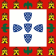
The flag of the Portuguese monarchy in the 14th and 15th centuries
In addition to these heraldic banners, however, there were also flags assigned to specific military units or groups of knights and mercenaries. During the Crusades, there were even flags for contingents made up of soldiers from different nations. Heraldic banners became increasingly widespread; they were often elaborately crafted unique pieces, or the heraldic motifs were painted onto cloth. However, in keeping with the system of the feudal era, the coat of arms or the flag remained associated with the feudal lord. Also significant in the history of colours were so-called 'vexilloids' – often items of clothing carried on a pole – such as the blue cloak of the Virgin Mary, the blue cloak of Saint Martin, or the green cloak of the Prophet Muhammad.
As trade flourished and became international and transcontinental, and as maritime powers began to conquer the world, it had become important to create distinguishing marks for ships. Whilst they had to display the colours of the country, the city or even the feudal lord, these had to be in a simplified, optimised form that allowed them to be distinguished from a great distance. Consequently, the colours and designs of ships’ flags and pennants were kept simpler.
During the Napoleonic era, the idea of nationhood began to flourish. The inhabitants – whether peasants or townspeople – found a new identity that began to detach itself from the figure of the prince and turned instead towards the land, the state or even the nation. The old banners gave way to simple flags – often with only a few designs or colours – which represented shared interests or identities. Furthermore, they suddenly had to be available in vast quantities and, consequently, had to be quick and easy to produce.
The evolution of colours thus led from coats of arms to banners, and from there to flags. Heraldry recognises only six colours:
red, blue, green and black (as colours), and gold and silver (as metals):
(Click on the colours to see explanations of each one)


Later on, a number of other colours were added, such as
purple, brown and orange, as well as more unusual shades like iron grey, ash grey and flesh tones.


There were also regional specialities; one need only think of 'Murado' (mulberry-coloured), which is found in Spain.
The colours on the coats of arms were assigned rather arbitrarily, without any particular underlying rationale; however, care was taken to ensure that at least one colour was combined with a metal, and that colours never touched colours or metals never touched metals. For the sake of convenience, these rules were relaxed somewhat over time, by using black outlines to separate the elements that touched one another.
In principle, these colours and their rules would still apply today and should give rise to little debate. Unfortunately, however, it so happened that – particularly at a time when flags and banners began to appear in large numbers and were mass-produced – no importance was attached to adherence to heraldic rules, and that – far worse – shades of colour began to emerge, namely every conceivable hue and variant, for example of blue, such as light blue, azure, sky blue, dark blue, heraldic blue, aquamarine, Prussian blue, royal blue, British blue, etc. This also happened with red or green, but by no means as frequently or in as many variations as is the case with blue. Why was that?
First and foremost, the pigments used. In the Middle Ages, the colours of coats of arms were painted onto shields or stone coat-of-arms reliefs. These colours usually withstood the varying degrees of wear and tear to which they were subjected with a certain degree of durability, and could be touched up easily and inexpensively. For this purpose, unmixed, pure, mineral pigments were used; organic pigments were less common. Mineral pigments included, for example, cobalt blue, ultramarine, cinnabar, red lead, verdigris, Paris green, as well as clay, which can occur in certain colours, and black derived from soot. Yellow (sulphur yellow) or white (lead white) were often used in place of gold and silver. Organic pigments included egg yolk or dyes that could be extracted from snails or certain animals, such as carmine red or purple. Depending on the raw materials and starting substances used, and on the concentration, each pigment naturally develops its own unique hue.
It is easy to imagine that the concentration and quality of the colour often varied, as it was a question of cost, or simply of the natural availability of the pigment in terms of quantity and composition. Similarly, the mixing of colours, binders and fixatives was by no means standardised, meaning that individual colours could vary considerably. This was not a problem, however, because in heraldry, blue is blue and red is red, regardless of how they might actually have been reproduced and used. Where access to raw colour materials – ideally always from a very specific source – was unrestricted and consistent, and a body of craftsmen working to set recipes could develop, preferences for certain shades of colour began to emerge even during this period. Similarly, one cannot infer the colours of historical flags from the original colouring of coats of arms, as the textile dye must have been entirely different. It is absolutely clear that variations were bound to occur here. But, as I said, this was not a problem in the past. Today, it is.
The problem is that flags, as historical artefacts, are viewed through a modern lens and are quickly assigned a specific colour designation. Take ‘light blue’, for example; this completely ignores the fact that the light blue is, in all likelihood, due to washing out and fading – a property of indigo (woad) that is still recognised and exploited today. Just think of the famous jeans. It gets even worse when the light blue is supposed to be a very specific shade. Bavaria officially permits two shades of blue for its diamond pattern today; even the lighter of the two is often rejected as being too ‘Prussian blue’. How blue would you like it to be? Would you like a bit more? Heraldically speaking, of course, this is all nonsense.
With the increasing prevalence of banners and flags, it became necessary to establish standardised processes that could produce results as uniform as possible. Experience in dyeing textiles had existed for a very long time, but the colours of the flags had to be particularly resistant to wind and weather – in other words, they had to be durable. Textile dyes are not mineral-based, as these would be washed out. Dyes derived from various plants were used for this purpose. The most famous of these are woad (later indigo) and madder, which were the subject of a thriving trade. The methods used to fix the colours were also important. It is easy to see that it was only the Industrial Age, with its norms and standards, that was able to bring a certain degree of stability to this field. Until the end of the 19th century, natural dyes were predominantly used for uniforms, clothing and even flags for cost reasons. Although chemical textile dyes began to be used in Great Britain from around 1860, it was not until around 1890 that they became established.
In the second half of the 19th century, the US Army referred to its uniform colour as dark blue, Prussian blue or navy blue (it was, in fact, a very dark blue), whilst the temporary trouser colour 'sky blue' was known as 'Saxon blue'. And navy blue effectively became black worldwide, as the blue 'look' introduced for sailors in the 19th century tended to 'darken considerably' in the harsh, salty sea air.
What is, and what was, 'dark blue' in the French army? The same dark blue, produced from indigo or woad, was known as 'royal blue' in royal France, 'republican blue' in revolutionary France under the Republic, and 'imperial blue' in imperial-Bonapartist France. Only in 1815 – during the Hundred Days following Napoleon’s return – did he order that the blue be 'dyed lighter' in order to save resources.
Here is another example of the subjective, visual perception of colour (quoted from Osprey Publishing, 'Men-At-Arms' series, volume 334, page 2): The colours of Spanish uniforms generally followed those of other European armies. However, 'blue' meant a very dark blue, 'emerald green' was a medium green, 'scarlet' was simply red, whilst 'purple' was redder than its British counterpart.
Or take the grey of the Confederate States of America’s army. Even today, it is not simply referred to as 'grey', but as 'gray', and it encompasses shades ranging from almost white to blackish-grey.
The Industrial Age naturally encouraged a preference for very specific shades of colour, which is reflected in the evolution of flag colours. In England in particular – the first industrialised nation – certain shades of colour came into fashion, leading to the emergence of colours such as navy blue or royal blue. With regard to blue in particular, a proliferation of shades began in the modern era. Every ruler, every country, every nation now attached importance to 'its own' shade of blue. This trend reached its peak with the flag of Sabah (a federal state of Malaysia in the north of the island of Borneo). A single flag featuring three different shades of blue!

The flag of Sabah
Such excesses are encouraged by industrial capabilities. One need only think of the 'Pantone Matching System' (PMS) – which, unfortunately, is now the standard for specifying colours on flags – which offers a palette of around 1,750 shades. It may be helpful to be able to say that the colour should look a certain way, but it is often overlooked that, even when formulating Pantone colours, different pigments may be used for a specific colour, which naturally affects the mixing result and colour stability. Just hold the colour swatches from two Pantone colour charts side by side. The differences are already striking here.
In 2014–2015, there was an art project centred on the flag of the European Union. The organisers commissioned European flags from all 28 Member States of the European Union. The colour of the European flag is specified as 'Pantone Reflex Blue'. Curiously, flags arrived from all 28 Member States in 28 different shades of 'Pantone Reflex Blue'.

The flag of the European Union
It is often overlooked that the vast majority of printed products are produced in the CMYK colour space, meaning that all colours must be mixed using proportions of cyan, magenta, yellow and black. This is only possible to a limited extent with Pantone colours. The same applies to images displayed on monitors, which are generated in the RGB (red-green-blue) colour space.
Many printed products produced using Pantone colours begin to deviate from their original colour state after just 10 minutes – that is, whilst they are drying. This is a favourite topic amongst advertising agencies for disparaging printed products, without them actually knowing what they’re talking about. A bit less theory and a bit more practical experience would work wonders here.
Quelle/Source:
Volker Preuß,
Wappenkunde,
Katechismus der Heraldik,
Flaggen-Atlas Erde,
Jürgen Kaltschmitt